How to Add Personality to Your Website
How to Add Personality to Your Website
Having a beautiful, clever or informational website isn’t enough. Your website needs to represent you and what makes you different than your competitors. People who are scouring through websites trying to find the right person to hire are wanting to see what you have to offer them. As in, you specifically, not just your industry or profession.
What makes you stand out? Whatever it is, it should be showcased on your website. There is only one of you. Having a website is like having real estate in a prime location. It should add value to your business! Don’t waste your space on the internet by letting your website look like everyone else’s. Use this chance to show the world (and your potential clients) who you are and what makes you the right for them!
Start adding your personality into your website with these tips
-
Make a list of all the things you love
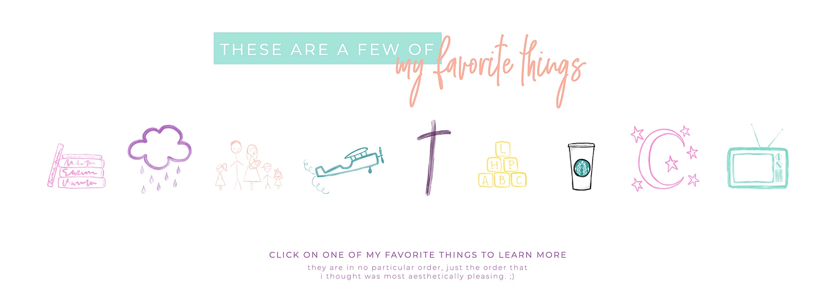
If you’re feeling overwhelmed by where to start and maybe aren’t even exactly sure what makes you unique, this will help! Because it’s in you, the things that make you different and make you stand out! The things that will help people see more of you and your indivudual personality. Are you an avid reader of fantasy books? Can you not stand coffee but you love tea? Does jazz music give you all the feels? Write a list of all the things you love! And all the things that are a part of your story! Then figure out how and where to incorporate them into your site!
Here’s a screen shot of “My Favorite Things” section on my website! These aren’t extravagant or clever things, they’re just the simple things that are some of the biggest parts of my life! And I’ve given enough so that there should be something relatable to almost everyone!
-
Be inspired by others
There’s nothing wrong with finding inspiration from other websites! Look around at the websites of photographers you love. Browse the SHOWIT template site for ideas. Be inspired by how others are infusing their personality and who they are into their site pages. Take that inspiration and make it your own! You can be inspired by someone else and still be YOU!
-
Use your voice
Are you silly or playful? Or maybe you’re more quiet and reserved? Perhaps you’re a little sarcastic? Or maybe you’re young at heart? These are the things to consider when feeling confident in sharing your voice. How do you want to reach people? What do you want to say? Don’t try to be something you’re not. You already have a voice. It’s in you. Find it and use it!
-
Colors
If you found this blog post through my website, you already know I’m a fan of color. Adding color to your site doesn’t have to look like mine though. It’s okay if you don’t like bright pink, purple and teal! Choose colors that feel like you and splash them over the pages of your site! Choose colors that make you happy! Colors that inspire you!
-
A captivating “about me” page
When you’re the face of your business (and if you’re a photographer or creative, you are!) then you need to actually be the face of your business! It can be uncomfortable, but you need to be front and center on your site! Potential photography clients aren’t just looking for what they’re purchasing, but who they’re purchasing from.
When people go to your “about me” page what they really want to see is what they have in common with you. They want to relate to you. They want to feel seen by you. And they want to know what you (and your brand) have to offer them. It might sound strange, but you should think of your “about me” page as being about them.
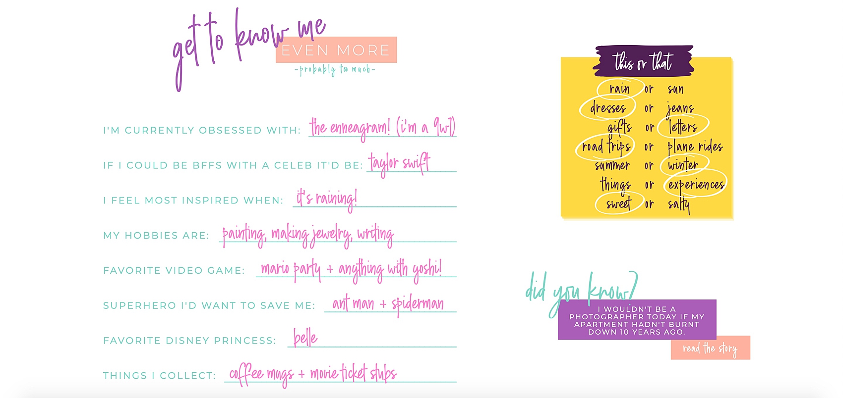
This is still your page, you can talk about yourself and you should! But it should be things that are easily relatable. Everyone won’t relate to you, but your ideal client should. Don’t make them work too hard to get to know you. I would stay away from long paragraphs, even if it’s about how you got started in photography. You could save that story for a blog post! People love bullet points and punchy (to the point) sentences. This is difficult for me as an over communicator, I understand if it’s difficult for you too. So, don’t be too hard on yourself. Do the best you can!
This snippet from my “Meet Leah” page is where I give fast facts in an easily skim-able way. People can quickly find if we have something in common, something we could bond over! I also add a link to the blog post where I talk about how I got started in photography. Rather than weighing down this page with the whole story, I give them the option to read more if they’re interested.
-
Make yourself at home
Your website should feel like home to you. It should be a place where you’re comfortable to be yourself and be seen for who you are. It shouldn’t be a place where you have to put on a facade and try to be someone you’re not. Let your clients get to know the real you. And make yourself at home.
-
Ask for feedback
If you’re building your website yourself, then design feedback from other creatives will be incredibly useful. However, that’s not the kind I’m talking about. Ask the people in your life, the people closest to you, if your website feels like YOU to them. When they browse the pages of your internet real estate, does it makes them think of you? Does it feel right? If it didn’t say your name or a have a photo of you, would they know it was yours?
Implement and apply
There are countless more elements that come into play when you’re wanting to create a beautiful, engaging and book-able website. I don’t know all their is to know about website design, but I do know how to add more of you and your personality into your site. If you take time the time to apply these tips when creating or redesigning your website, your personality will shine through and let your potential clients know exactly who you are!
More resources:
3 Styling Tips For Your Clients
Why I Shoot in Kelvin
How I Use Pez Dispensers
Using Light to Flatter Your Clients
Leave a Reply Cancel reply
let's be friends!
portrait photographer serving SCOTTSDALE, AZ and BEYOND
back to top
*ALL THE NATURE PHOTOS FEATURED ON MY WEBSITE ARE AVAILABLE FOR PURCHASE IN MY PRINT SHOP.

Love your website Leah! Any chance you could put me in touch with whoever helped you create the blog layout? I’d like to have something similar (less girly of course), but I like how easy it is to read and follow. My wife and I have our own ministry as musical and marriage “missionaries” and want to tell the story of what is going on with a simple blog. Not looking for more than one detailed page with a small picture and some text. Please let me know if you could connect me to whoever created your layout :-)
Hi Dustin! So exciting that you’re getting ready to launch a blog with your wife! My blog layout is actually from Showit, which is where host and design my website. They are integrated with WordPress as well! If you’re looking for a site as well, I definitely recommend them! I just double checked and it looks like my blog design (that I had free access to within Showit) was designed by Crystal Lee Design Studio! Perhaps reaching out to them could be a great place to start! :)